What is the purpose of a Logo?
April 24th, 2023

Designers don’t need to be told the importance of having a user-friendly mobile website. After all, it’s been years now that we’ve all now insanely used to it.
However, what makes a design user friendly is still something of a concern because some designers although promise to deliver a “user-friendly” design but never keep up to their claims. User friendly designs, especially in mobile websites, start with having an intuitive navigation.
Yes, a user-friendly navigation is what makes all the difference in mobile websites. So, what can be done to make the mobile website navigation impressive? Let’s discuss those “how-s”:
Content is the Priority, Navigation Comes Later
Don’t let the navigation menu on top dominate the content’s real estate. The main area that engages and retains the reader/visitor is the content. Therefore, give the content more room to flourish, while keeping the navigation highlighted, i.e., unhidden from the visitors’ view.
De-clutter the Navigation
Don’t put all the navigation menus out on the navigation bar. De-clutter the design by putting the menus under the drop-down navigation. The hamburger icon is a commonly used navigation menu, which can be used to nest all the menus under it. This way you can have a pretty neat and minimalist navigation menu.
Big and Clear Navigation
Since mobile screens are smaller in size as compared to desktops, the chances of errors on users’ side are high. The best way to minimize the odds of any error, it is better to use large and clear navigation menus. However, large icons or menus would mean fewer options. Therefore, it is important to add the most needed menus to the navigation.
Categorize and Nest Elements
Categorization allows the webmaster to put the elements in the right place under the right group. For instance, if you’re offering women’s apparel, you can group the commodity under tabs like “Most Popular”, “Designer Collection”, “New”, etc.
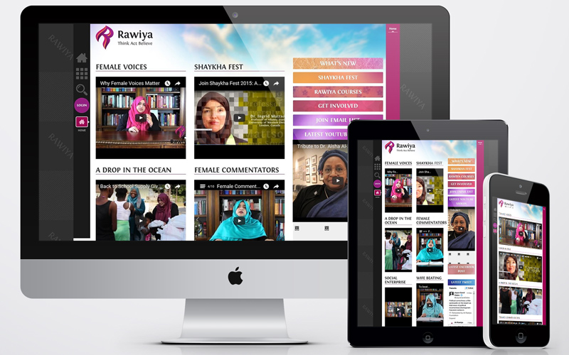
Check across Different Screens
When it comes to mobiles, the term isn’t limited to smartphones that usually have 5 inch screens. The term extends to even tablets, laptops, etc. Therefore, it is highly necessary to check how the navigation menu looks and functions across different screen sizes.