What is the purpose of a Logo?
April 24th, 2023

Web design consists of different elements, including typography, colors, shapes, white space, etc. Choosing the right colors, typography and shapes is creativity, but knowing how to organize these elements so that they are perfectly aligned and synchronized shows skills and experience of the designer. When it comes to synchronizing these elements, the most basic stuff is perhaps the contrast.
Now, when we say contrast, the first thing that comes to our mind is colors. Choosing the right color contrast is something that is part of our daily lives, for example when it comes to buying clothes, accessories, and wearables. But when it comes web design, the principles of contrast goes beyond just colors.
Color Contrast:

Every beginner designer knows that using contrasting colors is important. It’s basic that using black foreground text on a navy background would make it difficult to read the text. However, color contrast goes beyond that. Color contrast also means how one element on a web page contrast with the color of other elements on the same page.
For example, if your web page has a predominantly blue color theme, would a blue color CTA button stand out? Would it catch the user’s attention immediately? No. This is why all web design has a CTA button color that is different from the rest of the theme. This is to make sure that the CTA button catches the user’s attention immediately.
Size Contrast:

Who would have thought that the size contrast also matters in web design? Well…it’s no surprise. Size contrast might be the most basic one here. Take example of the size of a heading and a paragraph. The heading has bigger font size than the paragraph so that it stands out from rest of the text. The size contrast also applies to other elements, for example, the size of a banner image with respect to other elements on a website.
Shape Contrast:

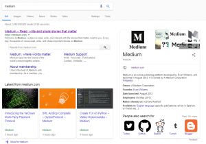
Shapes are how we identify objects and websites are filled with different shapes. Why not use only the rectangles or circles on a website? The different shapes on a website help us differentiate between the different elements on a website. The shapes don’t always mean the boxes you see on a website, but it also involves the icons. The Google search result has different shapes, circular logos, vertical rectangular boxes, horizontal rectangular search bars, voice and search icons and more. The search bars are easily visible because their shape is different than other shapes on the page.
Ensuring the contrast between different elements on a website, whether it is colors, shape or size, is important to ensure that each element looks different than others. This not helps the user in differentiating between objects but also helps in readability and navigation on the website.