What is the purpose of a Logo?
April 24th, 2023

2016 has been a year of rise and fall for several brands from all across the world. Many have been successful with their rebranding efforts and techniques, while some have become victims of harsh criticism.
Therefore, as the New Year is around the corner, we thought to take a quick flashback to some of the best rebrands of 2016. The reason for doing this is to give you strength, so that you can kick-start the new year with positive approach towards branding.
Let’s dive in…

We can’t say it a complete rebrand, but Netflix has been able to grab some serious attention and it ultimately turned its way quite favorably. The initial N is used as a standalone 3D ribbon which represents Netflix as a prime source among consumers. And, it’s because of the reason experts say that the new transformation offers more depth and vitality which stands out Netflix.

Before coming up with a new logo, MasterCard had not made any prominent changes in 20 years. But, a huge credit goes out to Pentagram’s partner Michael Bierut and designer Hamish Smyth who gave a brilliant make-over to MasterCard’s logo.
Without doing so much with the overlapping concept, except removing the comb effect, they put the wordmark and placed it outside of the symbol.

When it comes to rebranding, we can’t be done without talking about Instagram. Although this social platform has provided the design world with hundreds of questions, but it has also been able to grab serious acknowledgment from majority of the designers as well.
And we certainly consider it as one of the best in 2016. Because, gradient adds more fun and life to the concept as the previous one was getting older.

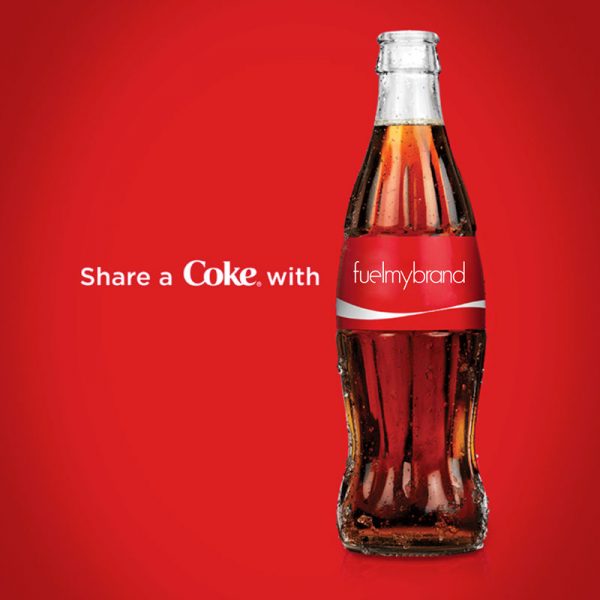
Coca-Cola’s ‘share a coke’ campaign defines why this soft drink brand is so much recognized in every part of the world.
The campaign not only brings out new identity of the brand, but also connects people by sharing happiness.